This diagram is taken from a series of work by Phillip Hurrell: Fracking air pollutions sources. Three levels of data are presented here.
- Agents are shown as black figures at the top.
- Chemical compounds are shown in text above the arc.
- Health risks are shown in text below the arc.
-
Line chart suggests that diagram shows relationship between agents and effects
-
However, the real effect (health risks), are not connected in any way (divided by curve arc)
-
The author acknowledges this gap with a disclaimer in the description.
-
So why did the author choose this method of visualilzation? To have a visually captivating diagram? To appear scientific or data-driven?
-
So why did the author choose this method of visualilzation? To have a visually captivating diagram? To appear scientific or data-driven?
-
Health risks labels should be placed beside the figure of human body, relative to the part of the body each health risk affects. By having a different channel from the chemical compounds, readers are less prone to be mislead.
-
Shades of orange used on figure of human body is misleading. What is the author trying to imply with the different intensity? That agents harm the body to different degree? Or is the author simply differentiating the different systems of the body? To which, a categoricaly color chart would be less misleading.
-
Missing explanation for why agents F and G is highlighted in orange. Are these the most harmful agents? Who knows?
-
Missing legend for agents A-G

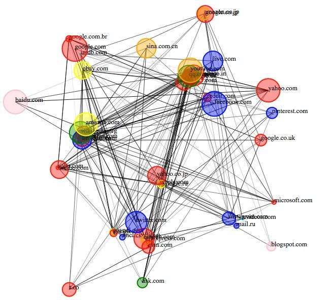
This diagram is created as an example by Github user deepthiyathiender, presummably, for the author to showcase a force-directed network graph. Nodes are visualized to 'pull' towards other randomly selected nodes.
Criticisms on data- N.A as many information is generated randomly.
-
The criticisms below assume that the objective of the diagram is to eventually show how connected these popular websites are.
-
Graph is entirely illegible. Text should minimally be plotted 'above' the circle patches.
-
Since the 'strength' of a connected popular connected website should be measured by the number of websites it is connect to, this infomation should be shown most clearly using the radius of the circles, as it is impossible to count the number of edges connected to each node.
-
While the edges of a force-directed graph represent crucial links, it is not very visually informative. The author should consider reducing the visual weight of the edges by reducing opacity, lineweight, or dashed lines.
-
In my opinion, the final outcome of force-directed network graphs should include a clustering algorithm, with the objective to color websites linked to each other in similar tones. This may not be a practical idea as it is likely that most popular websites these days are linked to many other popular websites.